Correlation
A unit-free number between −1 and 1 that measures the strength and direction of a linear relationship between two variables.
Prerequisites: Covariance, Variance and Standard Deviation.
The correlation coefficient measures how closely two variables follow a straight-line relationship. It is a single number between and : values near mean the points lie close to a rising line, values near mean they lie close to a falling line, and values near mean there is no linear trend.
Correlation is one of the most widely reported statistics, and one of the most widely misread. It measures only linear association, it can be dominated by a single unusual point, and it says nothing on its own about cause and effect. This article explains what it measures and where it misleads.
The version described here is Pearson’s correlation coefficient, the one meant when people say “correlation” without qualification.
Intuition
Covariance already tells us whether two variables tend to be above and below their means together. Its problem is scale: measuring a variable in minutes instead of hours multiplies the covariance by 60, so its size says nothing about how tight the relationship is.
Correlation fixes this by measuring each variable in units of its own standard deviation before comparing them. Convert every value to a z-score (how many standard deviations it lies above or below its mean), then ask how well the two sets of z-scores agree. If they match perfectly, the points lie exactly on a rising line and the correlation is . If one is always the negative of the other, the points lie on a falling line and the correlation is .
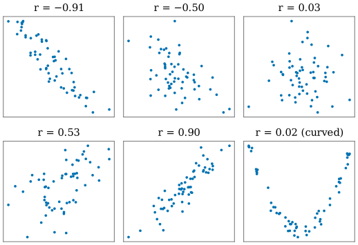
Notice in the figure that is still a fairly loose cloud; the band only looks tight near . And the last panel is a reminder that does not mean “no relationship”.
Definition
Population correlation
For random variables and with standard deviations and , the correlation is the covariance divided by both standard deviations:
The Greek letter (rho) is the usual symbol for a population correlation. It is undefined if either variable is constant, because then a standard deviation is zero.
Sample correlation
From pairs , with sample means , , sample standard deviations , , and sample covariance , the sample correlation is
The second form follows from the first because the factors in , , and cancel. It is the easiest form to use by hand.
An equivalent way to write it makes the “agreement of z-scores” idea explicit. With and ,
So is (almost) the average product of z-scores: positive products come from points that are on the same side of both means, negative products from points that are on opposite sides.
Key properties
- Range. always. This follows from the Cauchy–Schwarz inequality.
- The extremes mean a perfect line. exactly when all points lie on a straight line with positive slope, and exactly when they lie on a line with negative slope. The steepness of the line does not matter: points on and on both have .
- Unit-free. Changing units does not change . More precisely, for constants with and , if and have the same sign, and if they have opposite signs.
- Symmetric. The correlation of with equals the correlation of with . Correlation does not distinguish an “input” from an “output”.
- Independence implies zero correlation, but not the reverse; see covariance.
Worked example
We reuse the free-throw data from the covariance article: five players’ practice hours and free throws made out of 10, .
| product | ||||||
|---|---|---|---|---|---|---|
| 1 | 2 | 4 | 4 | 4 | ||
| 2 | 4 | 1 | 0 | 0 | ||
| 3 | 5 | 0 | 1 | 0 | ||
| 4 | 4 | 1 | 0 | 0 | ||
| 5 | 5 | 4 | 1 | 2 | ||
| Sum | 10 | 6 | 6 |
Here and .
Step 1: plug the column sums into the formula.
Step 2: check against the covariance route. The sample covariance is , and , . Then , the same answer.
Step 3: change units. If practice is recorded in minutes, the covariance becomes 90 and becomes about 94.9, but is still about 0.77. The correlation describes the shape of the point cloud, not the units on the axes.
Step 4: add one unusual point. Suppose a sixth player reports 10 hours of practice but makes only 1 throw (perhaps a data-entry error). Recomputing with all six players gives . A single point has turned a clear positive association into an apparently negative one. This is the most important practical lesson about : plot the data before trusting the number.
Correlation measures only linear association
The correlation coefficient asks one specific question: how well does a straight line describe the points? It can miss, or misdescribe, other patterns.
- Curved relationships. In the last panel of the figure, is almost a function of , but because rises on both sides of zero, the positive and negative contributions cancel and .
- Outliers. As in the worked example, one extreme point can create, destroy, or reverse an apparent correlation, especially in small samples.
- Groups. Combining two groups that each show no relationship, but differ in their averages, can produce a strong correlation in the pooled data, and vice versa.
A classic demonstration is Anscombe’s quartet (Anscombe, 1973): four small datasets with almost identical means, variances, correlations (about 0.82), and fitted regression lines, which look completely different when plotted. One is a reasonable linear cloud, one is a smooth curve, one is a perfect line spoiled by a single outlier, and one has all but one point at the same value.
Spearman’s rank correlation
When the relationship is monotonic (always increasing or always decreasing) but not linear, or when outliers are a concern, a common alternative is Spearman’s rank correlation. Replace each by its rank among the values and each by its rank among the values, then compute Pearson’s on the ranks. It equals whenever strictly increases with , even along a curve, and it is less sensitive to a few extreme values. It still cannot detect a U-shaped pattern like the one in the figure.
Correlation and causation
A correlation between two variables does not show that one causes the other. Three common alternatives:
- Confounding. A third variable influences both. Across the days of a year, ice-cream sales and the number of drownings are positively correlated, but neither causes the other: hot weather increases both swimming and ice-cream eating. Temperature is a confounder.
- Reverse causation. The causal arrow may run the other way from the one assumed.
- Coincidence. With many variables, some will be correlated by chance alone, especially in small samples.
Establishing causation usually requires a randomized experiment, or careful study design and assumptions that rule out the alternatives. Correlation is often a good reason to investigate, not a conclusion.
Correlation and regression
Correlation is closely tied to simple linear regression. The least-squares line that predicts from has slope
so the slope has the same sign as . Moreover, in simple regression the fraction of the variance of explained by the line, , equals . For the free-throw data, : the fitted line accounts for 60% of the variation in throws made.
This gives a more honest feel for the size of . A correlation of means the line explains only of the variance; a correlation of , often described as “moderate”, explains only .
Common misunderstandings
“r = 0 means the variables are unrelated.” It means there is no linear trend. Strong curved relationships, such as the U shape in the figure, can have near .
“A correlation of 0.5 means the variables are 50% related.” There is no such interpretation. If anything, is the fraction of variance a linear fit explains.
“A larger correlation means a steeper slope.” No. Correlation measures how tightly points cluster around a line, not how steep the line is. Points exactly on a nearly flat line have .
“Correlation implies causation.” See above. A confounder, reverse causation, or chance can all produce a correlation.
“The number is enough; there is no need to look at the data.” Anscombe’s quartet and the outlier in the worked example show otherwise. Always look at a scatter plot.
Further reading
- David Freedman, Robert Pisani, and Roger Purves, Statistics, 4th ed., W. W. Norton, 2007. An exceptionally clear, non-technical treatment of correlation, its pitfalls, and its link to regression.
- David M. Diez, Mine Çetinkaya-Rundel, and Christopher D. Barr, OpenIntro Statistics, 4th ed., 2019. Free online; introduces correlation alongside linear regression with many examples.