Quantiles, Percentiles, and Outliers
Values that cut ordered data into given proportions, the interquartile range, and how to find and handle unusual observations.
Prerequisites: Descriptive Statistics, Mean, Median, and Mode.
A quantile is a value that splits ordered data at a given proportion: the 0.9 quantile, also called the 90th percentile, is the value below which about 90% of the observations lie. The median is the 0.5 quantile. Quantiles describe a whole distribution by a few landmark points, and they are the basis of the box plot and of the most common rule for flagging outliers, observations that sit unusually far from the rest.
Quantiles are everywhere once you look: growth charts for children (“75th percentile for height”), exam results (“top 10%”), and service-level targets (“95% of requests answered within 200 milliseconds”) are all statements about quantiles.
Intuition
Sort the data from smallest to largest and walk along the list. The quantile for proportion is the point you have reached when a fraction of the data is behind you. Halfway along is the median; a quarter of the way is the first quartile; nine-tenths of the way is the 90th percentile.
Because quantiles depend only on the order of the values, they are not pulled around by extreme values the way the mean and standard deviation are. Except in the tiniest datasets, making the largest value ten times larger does not change the median or the quartiles at all. That robustness is why quantile-based summaries are preferred for skewed data.
Quantiles, percentiles, and quartiles
For a proportion between 0 and 1, the -quantile is a value such that roughly a fraction of the data are at or below and a fraction are at or above it. Named special cases:
- Percentiles express as a percentage: the 90th percentile is .
- Quartiles split the data into four parts: the first quartile , the second quartile (the median), and the third quartile .
- Deciles split the data into ten parts, at .
The interquartile range is the width of the middle half of the data:
It is a robust measure of spread, the natural companion of the median in the way that the standard deviation is the companion of the mean.
Quantiles of a distribution
For a probability distribution, quantiles are defined through the cumulative distribution function (see probability distributions). The -quantile is the smallest with . For a continuous distribution with a strictly increasing , this is simply the that solves . For example, the 0.975 quantile of the standard normal distribution is about 1.96, the number behind the familiar “mean ± 1.96 standard deviations” interval.
Sample quantiles are a matter of convention
With a finite dataset there is usually no value that has exactly a fraction of the data below it, so a rule is needed to pick one or to interpolate between neighbours. Many reasonable rules exist, and different software uses different ones by default. A widely used rule, the default in R, in NumPy, and in Excel’s QUARTILE.INC, works like this for sorted data :
- Compute the position .
- If is a whole number, .
- Otherwise, interpolate linearly between the two neighbouring sorted values. If with whole number and fraction , then .
Other rules, such as Excel’s QUARTILE.EXC or the textbook method of taking the median of each half of the data, can give slightly different answers. The differences shrink as grows and rarely matter in practice, but they explain why two programs may report different quartiles for the same small dataset. When it matters, state which method you used.
Worked example
A commuter records the delays, in minutes, of 13 trains, sorted:
Step 1: quartiles. With , the rule above gives positions :
- : , so ;
- median: , so ;
- : , so .
The interquartile range is minutes: the middle half of the delays span 5 minutes.
Step 2: a percentile that needs interpolation. For the 90th percentile, . This lies 0.8 of the way from to , so minutes.
Step 3: a different convention. Excel’s QUARTILE.EXC gives and for the same data. Neither answer is wrong; they are different definitions.
Step 4: fences. Using the 1.5 × IQR rule described below, the fences are
No delay is below , but 31 is above 17.5, so it is flagged as a possible outlier.
Step 5: how much does it matter? With the 31 included, the mean is about 8.9 minutes and the standard deviation about 7.5. Without it, they become about 7.1 and 3.7: one value doubled the standard deviation. The median moves only from 7 to 6.5, and the IQR (by the same rule) from 5 to 4.5.
Box plots and the 1.5 × IQR rule
A box plot draws the quartiles and flags unusual values. The version in common use today follows John Tukey’s exploratory data analysis:
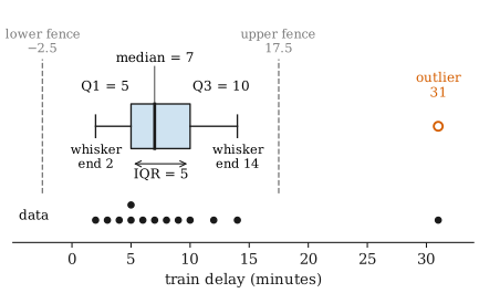
- The box runs from to , so its length is the IQR, and a line inside marks the median.
- The fences are at and . They are used for the calculation but usually not drawn.
- The whiskers extend from the box to the most extreme data values that lie inside the fences: here 2 and 14, not the fences themselves.
- Any value beyond a fence is plotted as an individual point and flagged as a possible outlier.
The factor 1.5 is a convention, chosen because it works reasonably in practice, not a law of nature. Some people also mark values beyond as “far out”. For data from a normal distribution, about 0.7% of values fall outside the 1.5 × IQR fences. So in a large normal sample, flagged points are expected: a sample of 1,000 will typically have about 7, even though nothing is wrong with any of them.
Outliers: what to do and what not to do
An outlier is an observation that lies unusually far from the bulk of the data. There is no universal definition; the 1.5 × IQR rule and z-scores beyond 3 are common screening rules, not tests of truth. A flagged value is a prompt to investigate, not a verdict.
When you find one, ask why it is there:
- An error. A typing mistake (a height of 1,750 cm instead of 175.0), a sensor fault, or a unit mix-up. If you can confirm the error, correct it or remove it, and record what you did.
- A different population. A measurement from a broken machine, or an adult in a dataset meant to contain children. It may be right to exclude it, provided the exclusion rule follows from the study’s definition, not from the value being inconvenient.
- A genuine extreme value. The 31-minute train delay may have really happened. Rare large values are often the most important observations: the floods in rainfall data, the crashes in financial data.
Good practice:
- Do look at the data in a plot before and after any decision.
- Do report the analysis with and without the questionable points if they affect the conclusions.
- Do consider robust summaries such as the median and IQR, which are barely affected by a few extreme values, rather than deleting data.
- Do not delete points just because they are flagged by a rule, or because they weaken the result you hoped for. That is a direct route to misleading conclusions.
- Do not remove outliers repeatedly. After you drop the most extreme values, the quartiles change and new points get flagged.
Common misunderstandings
“Outliers are errors.” Many are real. Whether to keep a point depends on how it arose, not on how far it lies from the others.
“The 90th percentile means scoring 90%.” A percentile is a position in the distribution, not a score. A test result at the 90th percentile was higher than about 90% of the results, whatever the raw score was.
“Quartiles are uniquely defined.” For a finite sample several conventions exist, and software defaults differ. For large datasets the differences are tiny.
“Points outside the whiskers must be removed before analysis.” The whisker rule is a display convention for drawing attention to points. It does not say what to do with them.
Further reading
- NIST/SEMATECH, e-Handbook of Statistical Methods, https://www.itl.nist.gov/div898/handbook/ — the exploratory data analysis chapter describes box plots and the detection of outliers.
- David M. Diez, Mine Çetinkaya-Rundel, and Christopher D. Barr, OpenIntro Statistics, 4th ed., 2019. Free online; covers percentiles, box plots, and robust statistics with real data.