Descriptive Statistics
Numbers and pictures that summarize a dataset's centre, spread, and shape, without making claims beyond the data.
Prerequisites: Types of Data and Variables, Populations and Samples.
Descriptive statistics are numbers and graphs that summarize a set of data: where its values are centred, how spread out they are, and what shape their distribution has. They turn a long list of observations into a few facts a person can take in at a glance.
Description is the first step of every analysis. Before fitting a model or running a test, you need to know what the data look like: whether there are unusual values, whether the distribution is lopsided, and whether the numbers are even plausible.
Intuition
Imagine the commute times of 200 people written out as a list. Reading the list tells you almost nothing. A summary such as “the typical commute is about 20 minutes, the middle half of people take between 10 and 30 minutes, and a few take over an hour” tells you most of what matters.
That sentence answers three questions, and they organize the whole subject:
- Centre: what is a typical value?
- Spread: how much do values vary around it?
- Shape: is the distribution symmetric or lopsided, with one peak or several, and are there unusual values?
Descriptive statistics describe only the data at hand. Using a sample to say something about a wider population is inference, which needs extra assumptions about how the data were collected.
Measures of centre
- The mean is the sum of the values divided by their number , that is, .
- The median is the middle value once the data are sorted (the average of the two middle values when is even). Half the observations lie below it and half above.
- The mode is the most frequent value or category.
The mean uses every value and is sensitive to extreme ones; the median is not. See mean, median, and mode for when to use which.
Measures of spread
- The range is the largest value minus the smallest. It is simple but depends entirely on the two most extreme observations.
- The standard deviation measures a typical distance of the values from the mean, in the same units as the data. See variance and standard deviation.
- The interquartile range (IQR) is the width of the middle half of the data: the distance from the first quartile (25% of values below) to the third quartile (75% below). Like the median, it is not affected by a few extreme values. See quantiles and outliers.
As a rule of thumb, report the mean with the standard deviation and the median with the IQR.
Shape and the pictures that show it
Numbers can hide important features, so always look at a plot of the data. For a single numerical variable the two standard plots are the histogram and the box plot. (For a categorical variable, use a bar chart of counts; see types of data.)
A histogram divides the number line into intervals of equal width, called bins, and draws a bar over each bin whose height is the number of observations in it. It shows the shape of the distribution: where values concentrate, whether there is one peak or several, and how long the tails are.
A box plot (or box-and-whisker plot) draws a box from the first to the third quartile with a line at the median, and “whiskers” out to the most extreme values that are not flagged as outliers. Points beyond are drawn individually. It shows less detail than a histogram, but makes the median, the IQR, and possible outliers easy to read, and several box plots side by side make a compact comparison of groups.
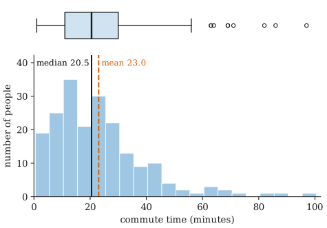
The commute times in the figure are right-skewed: most values are moderate, and a long tail stretches to the right. Both plots show it. In the histogram the bars fall away slowly on the right; in the box plot the right whisker is much longer than the left one and the flagged points are all on the right. The skew pulls the mean (23.0 minutes) above the median (20.5 minutes). A distribution with a long left tail is left-skewed; one whose two sides mirror each other is symmetric.
The appearance of a histogram depends on the bin width. Bins that are too wide hide structure; bins that are too narrow show mostly noise. It is worth trying a few widths.
Worked example
Ten people report their one-way commute times in minutes, already sorted:
Step 1: centre. The values add up to 270, so the mean is minutes. With , the median is the average of the 5th and 6th values, minutes. The mode is 25, the only repeated value.
Step 2: spread. The range is minutes. The squared deviations from the mean add up to 1962, so the sample variance is and the standard deviation is minutes.
Step 3: quartiles and IQR. A simple hand method takes the median of each half. The lower half (12, 15, 18, 20, 22) has median 18 and the upper half (25, 25, 30, 41, 62) has median 30, so the IQR is minutes. (Software that interpolates between values may report 18.5 and 28.75 instead; see quantiles and outliers.)
Step 4: shape and unusual values. The mean is above the median, and the gap from the median to the maximum (38.5) is much larger than from the minimum to the median (11.5). The data are right-skewed. By the common 1.5 × IQR rule, values above are flagged, so the 62-minute commute is a possible outlier worth checking.
Step 5: report. “The median commute was 23.5 minutes (IQR 18 to 30). One person reported 62 minutes, which pulls the mean up to 27 minutes.” This is more informative than the mean alone.
Common misunderstandings
“One number is enough.” A mean without a measure of spread hides most of the story. Two groups with the same mean can be very different; see variance and standard deviation.
“Summary statistics replace looking at the data.” Very different datasets can share the same mean, standard deviation, and even correlation. Always plot the data.
“A histogram is a bar chart.” A bar chart shows counts for separate categories, so the bars can be reordered and are usually drawn with gaps. A histogram’s bars sit on a number line: their order is fixed and adjacent bins touch.
“Descriptive statistics prove something about the population.” They describe the sample. Whether a difference in sample means reflects a real difference in the population is a question for hypothesis testing or confidence intervals.
Further reading
- David M. Diez, Mine Çetinkaya-Rundel, and Christopher D. Barr, OpenIntro Statistics, 4th ed., 2019. Free online; covers numerical summaries, histograms, and box plots with real datasets.
- NIST/SEMATECH, e-Handbook of Statistical Methods, https://www.itl.nist.gov/div898/handbook/ — the exploratory data analysis chapter describes histograms, box plots, and many other graphical tools.